-
Services
Services
Offerings
Learn moreSaaS Development

Web Application Development
Native & Cross-Platform Mobile Apps
Enterprise Software Solutions
API Architecture & Integration
Legacy System Modernization

Time Tracking Web App: Streamlining Productivity with a Custom Enterprise SaaS Solution.
Read case study
Offerings
Learn moreUser Research & Persona Mapping
UX Strategy & Wireframing
UI Design Systems & Libraries
Micro-Interactions & Motion Design
Offerings
Learn moreData Pipeline Design & Development
ETL & Data Warehousing
BI Dashboards & Advanced Reporting
Data Visualization & Analytics
Data Migration & Integration Optimization
Offerings
Learn moreMarketing & Sales Automation
Performance Marketing
Email & WhatsApp Campaigns
SEO & Content Strategy
Analytics & Conversions
CRM Implementation & Integration
Offerings
Learn moreCloud Architecture Design
CI/CD Pipeline Automation
Container Orchestration & Microservices
Cloud Migration & Cost Optimization
AIOps-Powered Intelligence
Cloud Security & Compliance
Share your project details
Share your details with us, and we'll reach out to discuss your needs.
Enquire now
Offerings
Learn moreMachine Learning
Generative AI
Conversational AI & Virtual Agents
Computer Vision Applications
AI-Powered Process Automation
AI Strategy & Consulting
Share your project details
Share your details with us, and we'll reach out to discuss your needs.
Enquire now
- Company

Scope of work
Brand identity, Logo design , Visual guidelines
Industry
Real Estate
Project timeline
2 Weeks
Project goal
Position this premium Central Delhi project as a market leader by crafting a cohesive, upscale brand identity that resonates with discerning audiences and boosts recognition.
Since 2022, Noseberry has managed all our creative work with reliability and excellence, consistently delivering high-quality design creatives & printables for all our projects. It has been a pleasure working with such a supportive and proactive team

Sheetal Kumar Agrawalla
Managing Director
2X
brand recall
50%
faster readiness
Inspired by our work?
Download the full case study.
Table of contents
More from Proptech and Real Estate
The Overview
Sawasdee Heights, a visionary real estate development by the Sawasdee Group, set out to redefine premium urban living through thoughtful architecture, sustainability, and lifestyle-driven amenities. Positioned as a high-end residential project, the brand required a visual identity that could reflect luxury, exclusivity, and long-term value.
As a new premium offering in a competitive real estate market, Sawasdee Heights needed more than just a logo. It required a cohesive brand ecosystem capable of influencing buyer perception across digital, print, and outdoor platforms.
The objective was to craft a brand identity that communicates prestige, architectural sophistication, and lifestyle excellence, setting a gold standard for superior living experiences.
The Challenge
Establishing a Luxury Positioning
The primary challenge was positioning Sawasdee Heights as a premium development from the outset. The brand needed to convey sophistication and exclusivity while maintaining approachability for discerning buyers.
Creating Visual Consistency Across Touchpoints:
The brand identity had to scale seamlessly across brochures, coffee table books, price lists, stationery, billboards, and newspaper advertisements without losing refinement.
Differentiating in a Competitive Market
Luxury real estate branding often relies on predictable visual cues. The challenge was to create a distinctive identity that stood apart while still aligning with high-end expectations.
Communicating “Heights” as a Concept
The name itself implied elevation, ambition, and growth. The logo and visual language needed to subtly reinforce upward movement and aspiration.
The Objective
The project was guided by clear branding goals. The first objective was to create a refined and timeless logo that reflects upward movement, architectural strength, and luxury living. The second objective was to build a cohesive visual identity system that could extend consistently across marketing and print materials. Additionally, the brand needed to resonate with high-end clientele while reinforcing trust, prestige, and exclusivity.
Ultimately, the aim was to design a complete brand framework that could support both immediate marketing needs and long-term project positioning.
The Solution
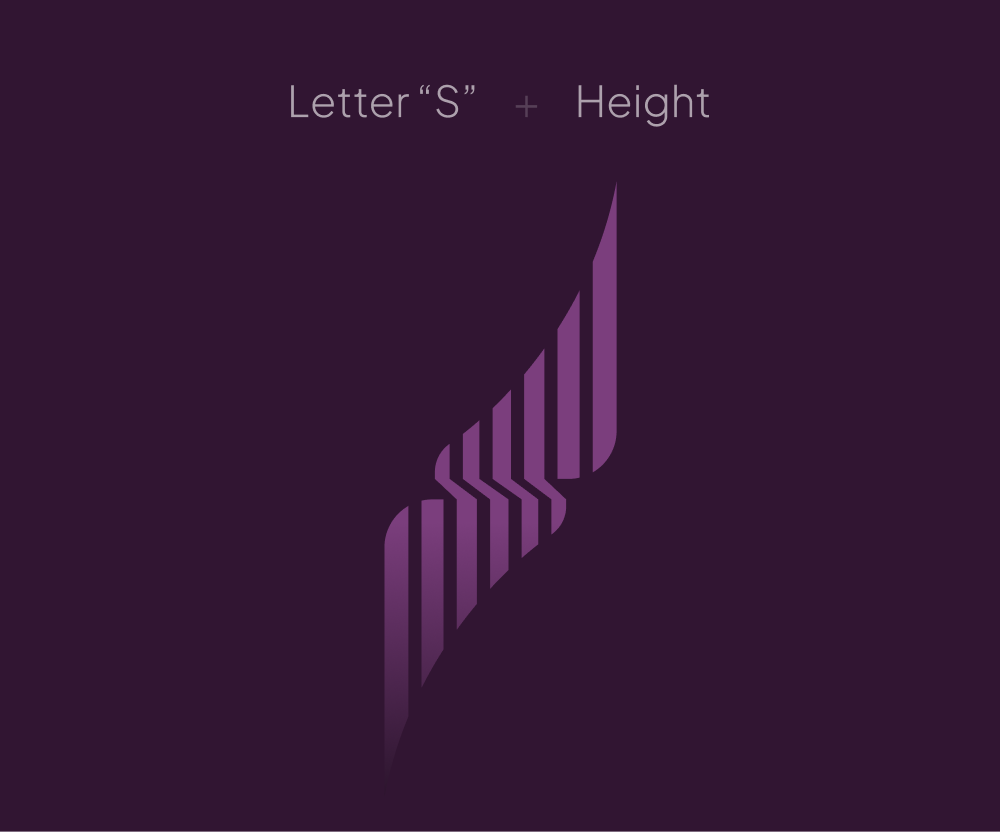
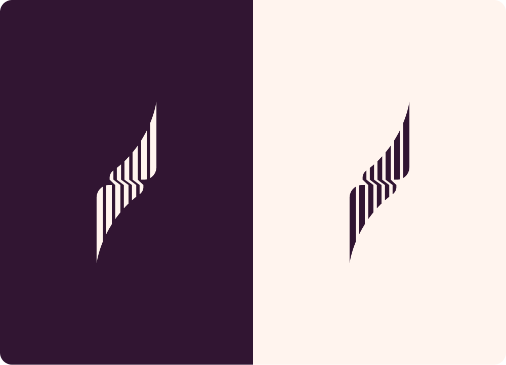
Luxury-Driven Logo Design:
To craft a premium identity, we studied high-end brands across real estate and adjacent luxury sectors. Our research focused on understanding color psychology, typography sophistication, and minimalist structural layouts.
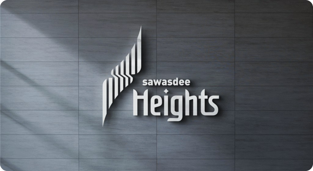
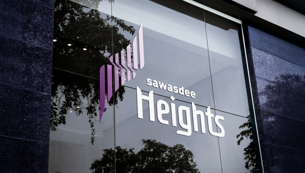
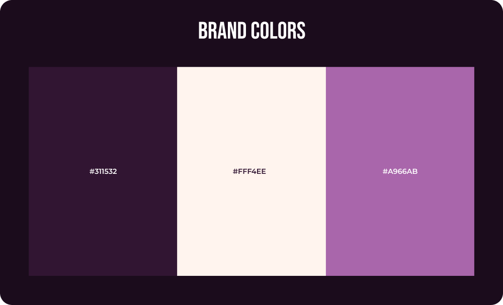
The final logo design incorporated rich purple tones paired with refined secondary colors to convey elegance and exclusivity. The upward visual motion within the logo subtly symbolized “Heights,” reflecting growth, elevation, and aspiration. The minimalist execution ensured timelessness and scalability.
Comprehensive Brand Identity System
Once the logo was finalized, we developed a structured brand identity framework to ensure consistency across all applications.
The identity system included:
A clear “Steps to complete” screen tells the user exactly where they stand (Joining Fee → Call Verification → Documents).
- Premium typography guidelines
- A geometric pattern derived from logo shapes
- Layout standards for structured hierarchy
- Defined color applications for print and digital use
The recurring pattern system reinforced brand recognition without overwhelming the visual aesthetic.

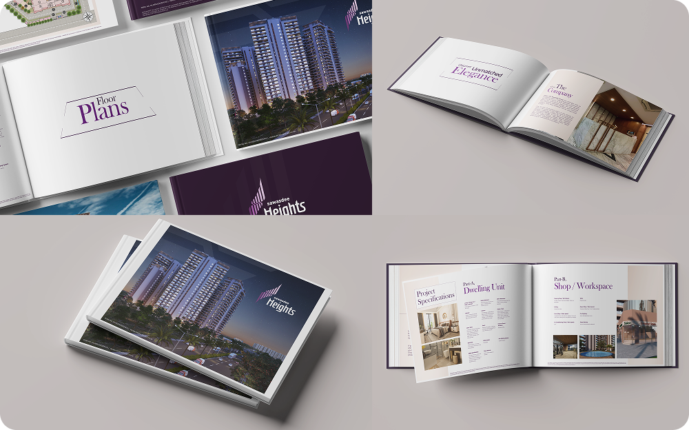
Brochure & Coffee Table Book:
We designed a high-end brochure using premium fonts, immersive visuals, and structured layouts to narrate the project’s luxury proposition. The coffee table book offered a refined presentation of project details, amenities, and architectural excellence, positioning Sawasdee Heights as an aspirational lifestyle investment.
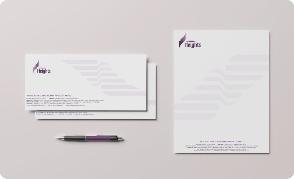
Price List & Stationery
The price list was crafted with minimalist clarity while maintaining brand richness through subtle color and pattern integration. Stationery including letterheads, business cards, and envelopes reinforced brand credibility through consistent application of identity elements.
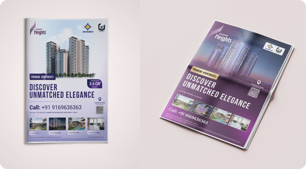
Newspaper Advertisements & Billboards
For large-format advertising, bold layouts were developed using signature purple tones and structured typography to capture attention while maintaining luxury appeal. The messaging and visuals were carefully aligned to attract premium clientele.
The Impact
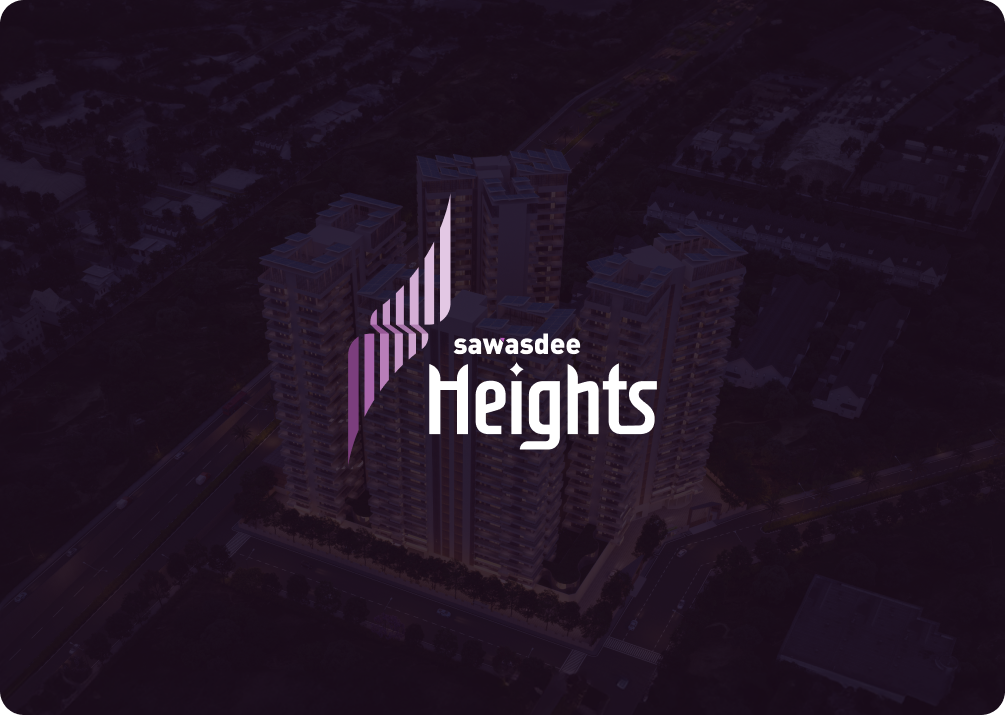
The new brand identity established Sawasdee Heights as a sophisticated and memorable luxury real estate project. The cohesive visual system strengthened brand recognition across all marketing platforms, from print materials to large-scale billboards.
The premium positioning enhanced buyer perception and reinforced the project’s value proposition. By maintaining consistent color usage, typography, and geometric motifs across all assets, the brand achieved a unified and distinguished presence in a competitive market.
Sawasdee Heights now stands as a refined, recognizable identity that reflects architectural excellence and elevated living standards.