


-
Services
Services
Offerings
Learn moreSaaS Development

Web Application Development
Native & Cross-Platform Mobile Apps
Enterprise Software Solutions
API Architecture & Integration
Legacy System Modernization

Time Tracking Web App: Streamlining Productivity with a Custom Enterprise SaaS Solution.
Read case study
Offerings
Learn moreUser Research & Persona Mapping
UX Strategy & Wireframing
UI Design Systems & Libraries
Micro-Interactions & Motion Design
Offerings
Learn moreData Pipeline Design & Development
ETL & Data Warehousing
BI Dashboards & Advanced Reporting
Data Visualization & Analytics
Data Migration & Integration Optimization
Offerings
Learn moreMarketing & Sales Automation
Performance Marketing
Email & WhatsApp Campaigns
SEO & Content Strategy
Analytics & Conversions
CRM Implementation & Integration
Offerings
Learn moreCloud Architecture Design
CI/CD Pipeline Automation
Container Orchestration & Microservices
Cloud Migration & Cost Optimization
AIOps-Powered Intelligence
Cloud Security & Compliance
Share your project details
Share your details with us, and we'll reach out to discuss your needs.
Enquire now
Offerings
Learn moreMachine Learning
Generative AI
Conversational AI & Virtual Agents
Computer Vision Applications
AI-Powered Process Automation
AI Strategy & Consulting
Share your project details
Share your details with us, and we'll reach out to discuss your needs.
Enquire now
- Company

Scope of work
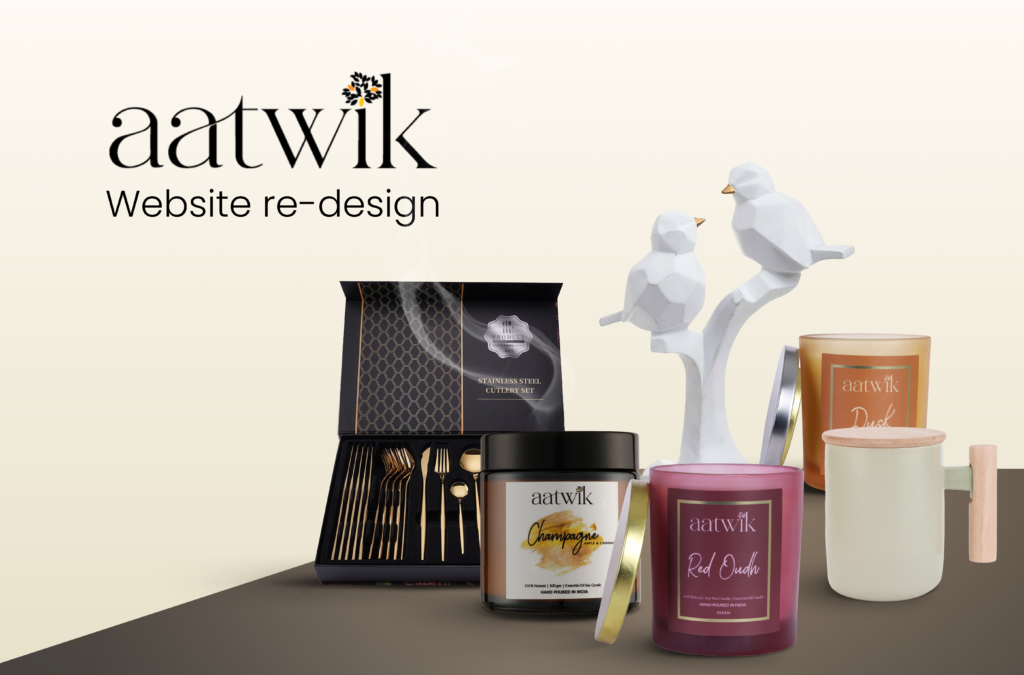
Website redesign
Industry
E-commerce
Project timeline
1 month
Project goal
Elevate Aatwik’s online storefront to enhance user engagement, boost conversion rates, and reflect the brand’s premium positioning.
We needed a premium-looking website to reflect our high-end offerings, and the team delivered outstanding design quality that increased conversions and improved engagement.

Achin
Founder
40%
smoother navigation flow
35%
better mobile usability
Inspired by our work?
Download the full case study.
Table of contents
Project Introduction
Aatwik specializes in handcrafted homeware made from natural materials, aiming to create a peaceful and inviting atmosphere for its customers. Their website redesign needed to reflect this calming, aesthetic appeal while improving user experience. Our task was to develop a user-friendly, visually captivating website that allowed visitors to easily explore Aatwik’s beautiful collections, find specific products, and appreciate the quality and artistry behind each item.
Client Requirements
- Enhanced Product Showcasing: Design a website that showcases Aatwik’s products as visually stunning works of art.
- Organized Navigation: Implement a clear, organized navigation structure for seamless browsing of product categories and relevant content.
- Improved User Experience: Make the website easy to explore, ensuring smooth navigation, faster load times, and better engagement for customers.
Old Website Analysis
The original Aatwik website had limitations impacting usability and visual appeal:
- Navigation Issues: Product categories were scattered, making it challenging for users to find specific items.
- Slow Loading Times: Certain sections were sluggish to load, negatively affecting user experience.
- Cluttered Layout: The visual structure lacked a clear hierarchy, with unclear categories and lackluster banners, hindering exploration.
The redesign aimed to address these issues by creating a cleaner, more intuitive layout that enhances the browsing experience.
Inspiration & Reference
We analyzed leading homeware websites to gain inspiration for the redesign, observing key trends:
- Large, High-Resolution Images: Many used visually striking images that allowed users to envision products in their homes.
- Quick Load Times: A fast-loading experience was essential for keeping users engaged.
- Intuitive Design Principles: We incorporated Jakob’s Law, which emphasizes familiar, user-friendly design to simplify navigation.

Key Outcomes from Analysis
Our research reinforced three essential principles for Aatwik’s website:
- Showcasing Product Quality: High-resolution images should capture the aesthetic beauty of homeware, allowing users to appreciate the detail and craftsmanship.
- Optimizing Speed and Navigation: A smooth, fast-loading experience is crucial to keep users engaged and maintain interest.
- Intuitive Design: Familiar navigation patterns make the website easy to explore, enhancing user satisfaction and reducing friction.

Design System and Components
Aatwik’s redesign adopted a color scheme inspired by tranquility and well-being, aligning with the brand’s peaceful, nature-driven ethos. The Poppins typeface was selected for its clean, approachable style, enhancing readability across all devices.
Color Palette:
- #A6917C – Earthy Beige
- #49423F – Soft Gray
- #141414 – Deep Charcoal

Thought Process Behind the Website Header
Aatwik’s previous website scattered its seven product categories throughout various sections, leading to a disorganized browsing experience. To address this, we implemented a persistent category navigation header. This “sticky” solution allows users to access any product category from any page, eliminating unnecessary scrolling and promoting a seamless, intuitive navigation flow.

Website Banners and Hero Section
The redesigned hero section captivates visitors with soothing visuals that align with Aatwik’s brand values. Interactive product category banners allow visitors who know what they’re looking for to dive directly into the relevant collections. This restructured banner design balances aesthetics and functionality, setting the tone for an enjoyable shopping experience.

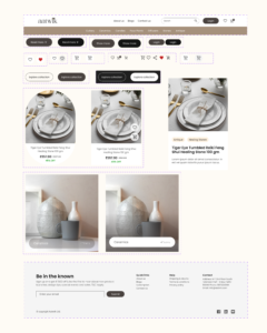
Product Categories
In the “Collection” section, products are displayed with high-resolution images that highlight Aatwik’s craftsmanship. To maintain a clean look, we placed category names in low-opacity text, allowing product visuals to take center stage. Upon hovering, the category name becomes clearly visible, offering a user-friendly experience that encourages exploration.

Responsiveness
We ensured Aatwik’s website is fully responsive across all devices. The website automatically adjusts its layout for optimal viewing on smartphones, tablets, and desktops, making it easy for users to browse and discover Aatwik’s offerings regardless of their device.

