


-
Services
Services
Offerings
Learn moreSaaS Development

Web Application Development
Native & Cross-Platform Mobile Apps
Enterprise Software Solutions
API Architecture & Integration
Legacy System Modernization

Time Tracking Web App: Streamlining Productivity with a Custom Enterprise SaaS Solution.
Read case study
Offerings
Learn moreUser Research & Persona Mapping
UX Strategy & Wireframing
UI Design Systems & Libraries
Micro-Interactions & Motion Design
Offerings
Learn moreData Pipeline Design & Development
ETL & Data Warehousing
BI Dashboards & Advanced Reporting
Data Visualization & Analytics
Data Migration & Integration Optimization
Offerings
Learn moreMarketing & Sales Automation
Performance Marketing
Email & WhatsApp Campaigns
SEO & Content Strategy
Analytics & Conversions
CRM Implementation & Integration
Offerings
Learn moreCloud Architecture Design
CI/CD Pipeline Automation
Container Orchestration & Microservices
Cloud Migration & Cost Optimization
AIOps-Powered Intelligence
Cloud Security & Compliance
Share your project details
Share your details with us, and we'll reach out to discuss your needs.
Enquire now
Offerings
Learn moreMachine Learning
Generative AI
Conversational AI & Virtual Agents
Computer Vision Applications
AI-Powered Process Automation
AI Strategy & Consulting
Share your project details
Share your details with us, and we'll reach out to discuss your needs.
Enquire now
- Company


Scope of work
Rebranding
Industry
Foods and beverages
Project timeline
8 weeks
Project goal
Reimagine Bliss by Anju’s packaging and digital storefront to showcase its artisanal heritage, streamline the ordering journey and drive higher customer engagement.
Partnering with Noseberry Digitals has made our artisanal brand shine online and deliver impactful offline campaign creatives. Their team’s exceptional quality and swift delivery make every collaboration a pleasure.

Anju Kalhaan
Founder
40%
repeat purchase uplift
70%
brand recall
Inspired by our work?
Download the full case study.
Table of contents
More from E-Commerce
Overview
Bliss by Anju is a handcrafted cookie and biscuit brand rooted in traditional recipes and homemade care. What began as a small, homegrown kitchen venture quickly grew into a trusted local favorite, driven by repeat customers and strong word-of-mouth.
As the brand started expanding beyond local orders, there was a clear need to evolve its identity. The founder wanted Bliss by Anju to feel premium, recognizable, and shelf-ready while still preserving the warmth, honesty, and authenticity that defined the brand. Our engagement focused on rebranding Bliss by Anju to support its transition from a local favorite to a scalable artisanal food brand with a strong digital and physical presence.
The Challenge
Bliss by Anju had already earned strong trust through product quality and loyal offline customers. However, as the brand began scaling beyond local orders, several structural challenges became evident in how the brand was presented and experienced.
The biggest gap was not the product itself, but how the brand communicated its value. The existing identity did not fully reflect the care, craftsmanship, and authenticity that went into every handmade cookie and biscuit. While customers who tried the products loved them, the brand lacked a strong visual system that could instantly convey this quality to new audiences.
Key challenges included:
- Limited brand recall:
The existing logo and visual elements lacked distinctiveness, making it difficult for the brand to stand out on shelves or remain memorable in digital spaces. - Inconsistent brand expression:
Packaging, digital assets, and offline materials did not follow a unified visual language, resulting in a fragmented brand experience. - Packaging not aligned with product quality:
While the products were premium and handcrafted, the packaging did not fully communicate purity, freshness, or artisanal value at first glance. - Balancing tradition with modern appeal:
The brand needed to preserve its homemade warmth and traditional roots while appealing to modern, design-aware consumers. - Lack of a strong digital narrative:
There was no clear platform to tell the brand’s story, highlight ingredients, or communicate the care behind each product to a wider audience. - Scalability concerns:
As the business grew, the absence of a structured identity system made it difficult to maintain consistency across new products, packaging formats, and future marketing channels.
The challenge, therefore, was to elevate Bliss by Anju from a locally loved product to a recognizable artisanal brand without losing the authenticity and emotional connection that made customers trust it in the first place.
The Objective
The rebranding initiative was guided by clear strategic goals:
- Create a refined brand identity that reflects quality, care, and craftsmanship
- Improve brand recall and shelf presence through thoughtful packaging design
- Establish a consistent visual language across packaging, website, and marketing assets
- Blend traditional values with a modern, premium aesthetic
- Build a scalable brand system that supports future growth
These objectives ensured the brand could grow confidently without losing its soul.
Our Approach
Our approach was structured around the following principles:
Deep brand understanding
We began by understanding the story behind Bliss by Anju its origins, recipes, values, and emotional connection with customers. This helped us define what should remain unchanged and what needed to evolve.
Audience and usage context analysis
We considered how customers discover, purchase, and experience the brand both online and offline. This included shelf visibility, unboxing moments, mobile browsing behavior, and repeat purchase touchpoints.
Balancing tradition with modern design
The visual direction focused on blending warmth, purity, and handmade charm with clean layouts, modern typography, and premium detailing.
System-first thinking
Instead of designing isolated assets, we created a flexible identity system that could scale across packaging formats, website pages, banners, and future marketing materials.
Consistency across touchpoints
From logo refinement to packaging design and website UI, every element was aligned to deliver a cohesive and recognizable brand experience.
Practical execution for growth
Designs were created with real-world application in mind easy printing, digital adaptability, and clarity at different sizes and formats.
This approach ensured that the final outcome was not just visually appealing, but also functional, scalable, and aligned with Bliss by Anju’s long-term vision.
The Solution
We delivered a complete brand refresh that aligned visual identity, packaging, and digital experience into one cohesive system.
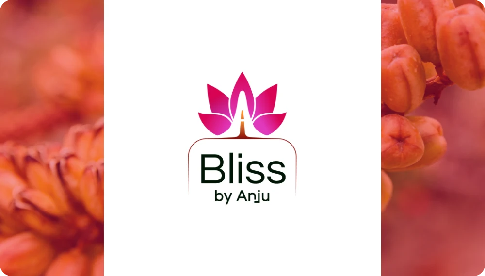
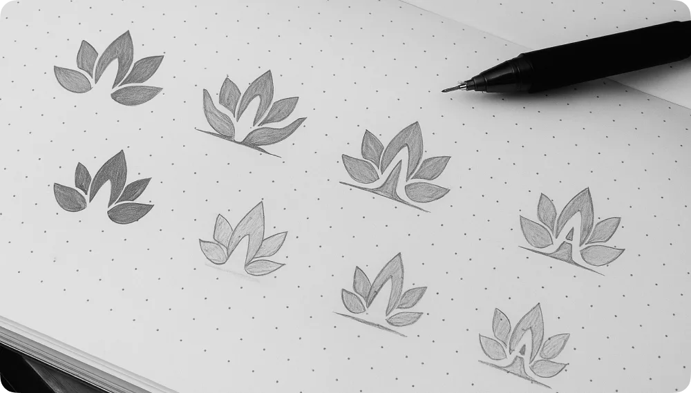
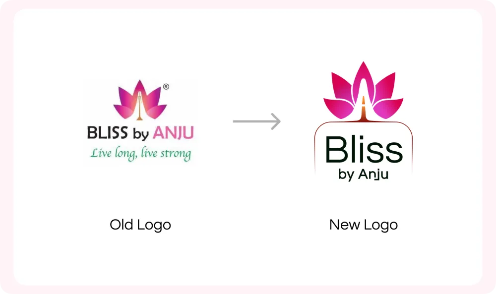
Brand Identity & Logo Redesign
The logo was redesigned to better represent Bliss by Anju’s values of purity, nourishment, and handcrafted goodness. We retained the lotus symbol to preserve brand continuity, refining its form for clarity, balance, and versatility across packaging and digital platforms. Custom typography was developed to feel warm yet premium, ensuring legibility and trust.
Key improvements included:
- A clean, balanced icon with symbolic roots in wellness and positivity
- Improved scalability for jars, pouches, social media, and web use
- A refined color palette inspired by earthy, natural ingredients
- Typography aligned with an approachable yet premium brand personality
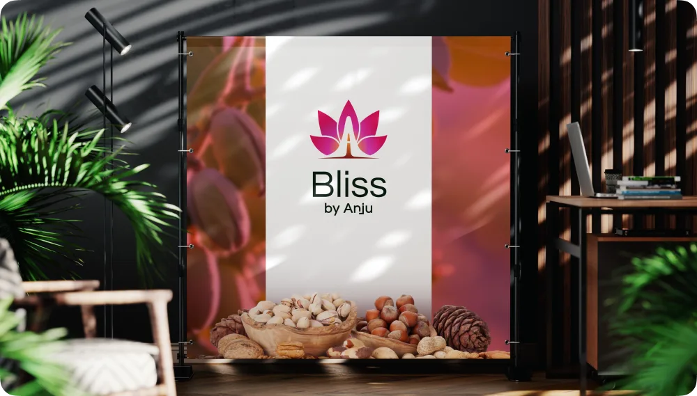
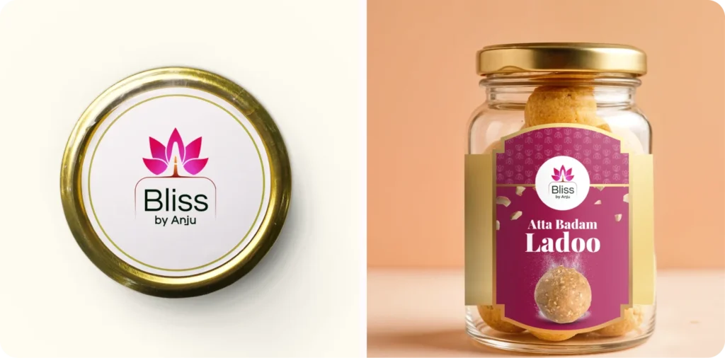
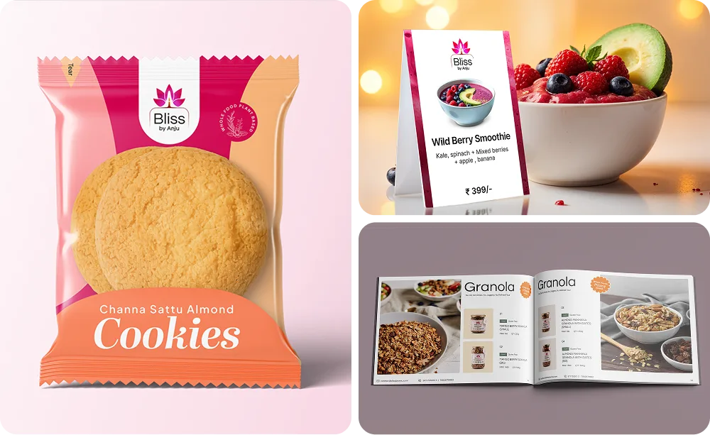
Visual Identity & Packaging Design
Packaging played a central role in expressing the brand’s story. Transparent jars were chosen to showcase product purity and quality, while soft pastel labels and minimal typography created a fresh, honest look. Stand-up pouches with a smooth, tactile finish added a sense of care and premium craftsmanship.
Every packaging element was designed to feel thoughtful, nourishing, and aligned with the handmade nature of the products.
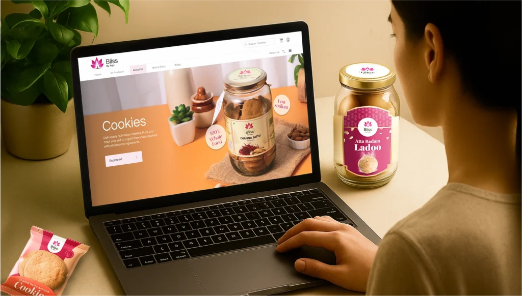
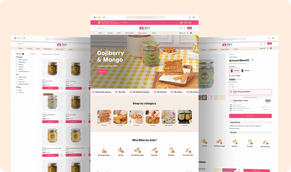
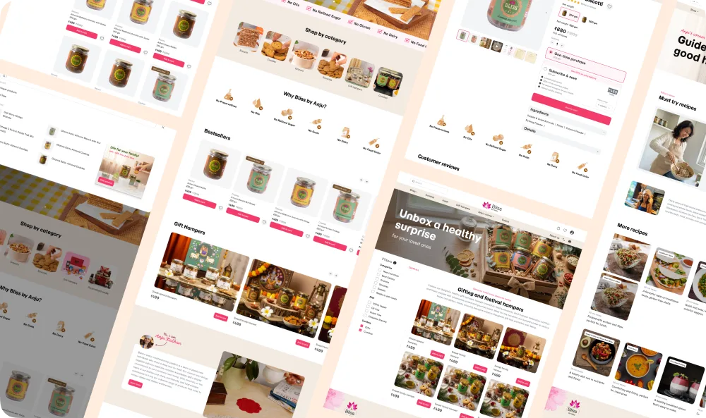
Website Design & Digital Experience
The website was designed to mirror the calm, welcoming feel of a bakery experience. Warm tones, soft edges, and a clean layout guide users naturally through the brand story and product offerings.
Website highlights included:
- User-centered layouts with intuitive navigation
- Storytelling-driven product pages featuring real imagery and ingredient cues
- Mobile-first design for seamless browsing and ordering
- Consistent use of brand colors, typography, and visuals across pages
- Clear CTAs and contact touchpoints to drive engagement
Impact
The new brand identity and digital presence gave Bliss by Anju a clear step-change in how the brand is perceived and experienced across both online and offline touchpoints.
The refreshed identity helped the brand transition from a local, homegrown product to a polished, premium artisanal offering while preserving the warmth and authenticity that existing customers valued. The visual system now communicates quality, care, and trust at first glance, whether seen on packaging, digital screens, or retail shelves.
Key impact areas included:
- Stronger brand recall and shelf presence
The refined logo, cohesive color palette, and thoughtfully designed packaging improved visual differentiation, making the brand instantly recognizable in competitive retail and online environments. - Improved customer trust and perceived quality
Consistent storytelling across packaging and website reinforced the handcrafted nature of the products while elevating perceived value, supporting premium positioning. - Seamless digital-to-physical brand experience
Alignment between packaging, website design, and digital visuals created a unified brand journey, strengthening emotional connection with customers. - Scalable foundation for growth
The structured brand system enables Bliss by Anju to expand into new product lines, retail formats, and marketing channels without losing consistency.
Overall, the engagement positioned Bliss by Anju with a confident, cohesive brand presence ready to grow beyond its local roots and compete effectively in the premium artisanal food market.

Conclusion
This engagement demonstrates how thoughtful branding can elevate a homegrown food business into a premium, scalable brand. By aligning visual identity, packaging, and digital experience, Bliss by Anju gained a cohesive brand system that preserves its handcrafted essence while supporting expansion. The result is a brand that feels both deeply personal and professionally positioned for the future.
