


-
Services
Services
Offerings
Learn moreSaaS Development

Web Application Development
Native & Cross-Platform Mobile Apps
Enterprise Software Solutions
API Architecture & Integration
Legacy System Modernization

Time Tracking Web App: Streamlining Productivity with a Custom Enterprise SaaS Solution.
Read case study
Offerings
Learn moreUser Research & Persona Mapping
UX Strategy & Wireframing
UI Design Systems & Libraries
Micro-Interactions & Motion Design
Offerings
Learn moreData Pipeline Design & Development
ETL & Data Warehousing
BI Dashboards & Advanced Reporting
Data Visualization & Analytics
Data Migration & Integration Optimization
Offerings
Learn moreMarketing & Sales Automation
Performance Marketing
Email & WhatsApp Campaigns
SEO & Content Strategy
Analytics & Conversions
CRM Implementation & Integration
Offerings
Learn moreCloud Architecture Design
CI/CD Pipeline Automation
Container Orchestration & Microservices
Cloud Migration & Cost Optimization
AIOps-Powered Intelligence
Cloud Security & Compliance
Share your project details
Share your details with us, and we'll reach out to discuss your needs.
Enquire now
Offerings
Learn moreMachine Learning
Generative AI
Conversational AI & Virtual Agents
Computer Vision Applications
AI-Powered Process Automation
AI Strategy & Consulting
Share your project details
Share your details with us, and we'll reach out to discuss your needs.
Enquire now
- Company

Scope of work
Logo design and branding
Industry
Venture firm
Project timeline
1 week
Project goal
2X
brand recall
7
day launch
Inspired by our work?
Download the full case study.
Table of contents
Overview
Nath Capital is a specialized venture capital firm focused on the Co-Living and Prop-Tech sectors. The mandate was to create a compelling brand identity that simultaneously conveys the stability of real estate investment and the dynamic, high-growth potential of the modern co-living industry. The resulting brand framework links architectural precision with financial acceleration, positioning Nath Capital as the essential partner for founders who are building community-focused, scalable real estate solutions and for investors seeking significant sector growth.
The Challenge
The core challenge was to connect two very different worlds: the stable, asset-heavy nature of real estate and the fast-moving, community-driven co-living startup ecosystem. The brand had to build trust with institutional investors by showing long-term stability, while also attracting modern founders who care about innovation, technology, and rapid growth.
We needed to avoid appearing too conservative (like a typical real estate fund) or too risky (like a pure tech startup). The goal was to create a brand identity that confidently blends reliable and structured, yet modern, scalable, and future-focused.
Our Approach
Our strategic approach, centered on ‘Built-in Growth’, was designed to seamlessly blend the firm’s financial intelligence with its specialization in physical assets. We positioned Nath Capital as an architectural firm for investment, providing the blueprint for scaling co-living businesses. This led to a design language rooted in structured lines and upward momentum, ensuring that every visual touchpoint communicated a balance of real estate permanence and the aggressive, future-focused growth necessary in the venture space, ultimately driving the evolution of the co-living model.

Design Concept
The visual centerpiece, the logo, is a masterful blend of the three core factors. The abstract, three-layered structure immediately evokes the real estate concept of a roofline or building block. Simultaneously, the clear upward angle signifies exponential growth and strategic ascent in value. The subtle architectural stacking of the lines further represents the multi-layered strategy required to successfully fund and scale co-living ventures from property acquisition to technology integration and community management, making the mark a comprehensive symbol of the firm’s specialized expertise.


Brand colours


Brand patterns
The visual identity incorporates a dynamic ‘Ascent Chevron’ pattern, directly inspired by the upward-pointing angles of the logo and showcased prominently in the provided examples. This repetitive, geometric pattern symbolizes continuous upward growth and the structured, scalable nature of real estate development within co-living. It provides a versatile graphic element that can be subtly applied as a background texture, an intentional design accent, or a navigational motif. Additionally, the brand leverages high-quality, aspirational architectural photography, focusing on modern building angles and upward perspectives, to visually reinforce the firm’s deep connection to tangible real estate assets and the progressive future of co-living spaces.

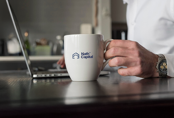
3D mockups
The 3D mockups demonstrate the brand’s holistic application across the physical and digital environments where real estate and growth intersect. Mockups include the logo cast in metal on the wall of a sleek, modern co-living space lobby, solidifying its real estate presence. Others feature the identity across responsive investor dashboards, highlighting the focus on growth metrics and tech-enabled insights. These visualizations prove the brand can successfully articulate the firm’s sophisticated financial perspective while remaining deeply integrated and relevant to the human-centric co-living experience.


