-
Services
Services
Offerings
Learn moreSaaS Development

Web Application Development
Native & Cross-Platform Mobile Apps
Enterprise Software Solutions
API Architecture & Integration
Legacy System Modernization

Time Tracking Web App: Streamlining Productivity with a Custom Enterprise SaaS Solution.
Read case study
Offerings
Learn moreUser Research & Persona Mapping
UX Strategy & Wireframing
UI Design Systems & Libraries
Micro-Interactions & Motion Design
Offerings
Learn moreData Pipeline Design & Development
ETL & Data Warehousing
BI Dashboards & Advanced Reporting
Data Visualization & Analytics
Data Migration & Integration Optimization
Offerings
Learn moreMarketing & Sales Automation
Performance Marketing
Email & WhatsApp Campaigns
SEO & Content Strategy
Analytics & Conversions
CRM Implementation & Integration
Offerings
Learn moreCloud Architecture Design
CI/CD Pipeline Automation
Container Orchestration & Microservices
Cloud Migration & Cost Optimization
AIOps-Powered Intelligence
Cloud Security & Compliance
Share your project details
Share your details with us, and we'll reach out to discuss your needs.
Enquire now
Offerings
Learn moreMachine Learning
Generative AI
Conversational AI & Virtual Agents
Computer Vision Applications
AI-Powered Process Automation
AI Strategy & Consulting
Share your project details
Share your details with us, and we'll reach out to discuss your needs.
Enquire now
- Company

Scope of work
Logo design and branding
Industry
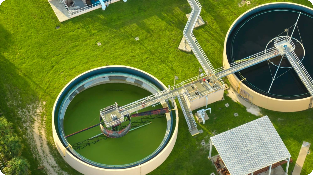
Biowaste management
Project timeline
1 week
Project goal
40%
higher brand engagement
2X
stakeholder recognition
Inspired by our work?
Download the full case study.
Table of contents
The Overview
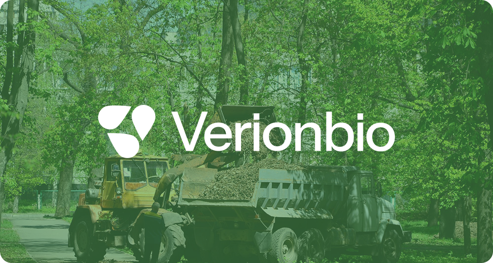
Verionbio is an eco-conscious organization focused on sustainable water recycling and bio-waste management solutions. The company operates with a strong commitment to environmental responsibility, circular resource use, and long-term ecological restoration.
As a purpose-driven brand working in the sustainability and environmental services space, Verionbio required a clear and distinctive visual identity that could reflect its mission while remaining credible to industrial, community, and institutional stakeholders. The engagement focused on crafting a clean, meaningful brand identity that communicates trust, innovation, and environmental stewardship.
The Challenges
Verionbio operates in a sector where credibility, responsibility, and clarity are critical. The primary challenge was translating complex environmental values into a simple yet powerful visual language.
Key challenges included:
- Representing sustainability and water recycling without relying on generic eco-symbolism
- Creating a brand identity that feels modern, credible, and long-lasting.
- Communicating environmental responsibility while maintaining professional seriousness
- Ensuring the identity could scale across digital, physical, and environmental applications.
- Building recognition in a sector often perceived as technical rather than aspirational.
The challenge was to design a brand that feels purpose-led, trustworthy, and future-ready.
The objective
The engagement was guided by objectives focused on clarity, symbolism, and scalability.
The primary objectives were to:
- Create a distinctive brand identity aligned with Verionbio’s sustainability mission
- Visually communicate water recycling, renewal, and circularity in a refined manner
- Establish a professional and credible presence suitable for environmental and industrial contexts
- Develop a scalable visual system usable across branding, communication, and physical assets
- Enhance brand recognition while remaining authentic to environmental values
The Solution
We delivered a thoughtful, nature-inspired brand identity system designed to reflect Verionbio’s role in environmental stewardship and sustainable resource management.
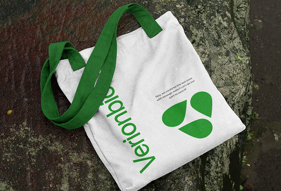
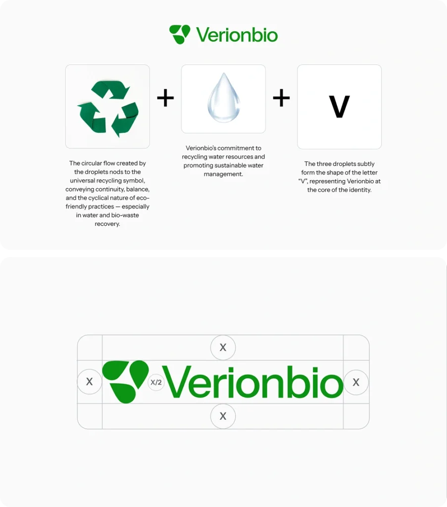
Logo Design & Symbolism
The Verionbio logo was designed to be clean, modern, and meaningful. The droplet-inspired forms subtly create a “V” shape, reinforcing brand recognition while symbolizing water, purity, and recycling. The circular flow within the mark represents renewal, continuity, and sustainable cycles–core to Verionbio’s mission.
The logo balances simplicity with symbolism, ensuring clarity across applications without visual clutter.
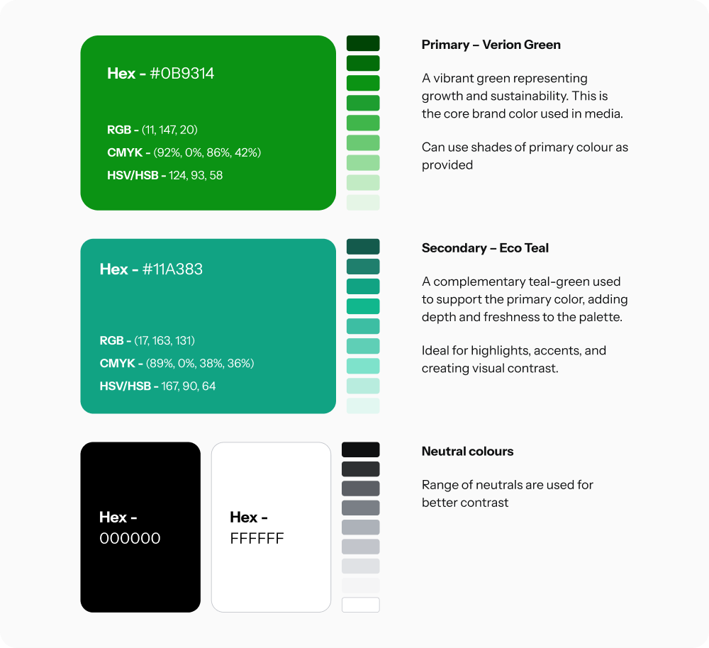
Brand Color System
A calm, nature-inspired color palette was developed to reflect water, sustainability, and ecological balance. The colors reinforce trust and environmental responsibility while remaining versatile across digital and physical branding.
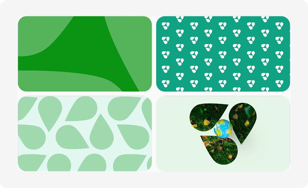
Brand Patterns
Brand patterns were derived from the logo’s droplet forms and circular motion. These patterns visually express the natural flow of water and the cyclical nature of recycling. Designed to be seamless and flexible, the patterns support background usage, environmental graphics, and branded materials without overpowering the core identity.
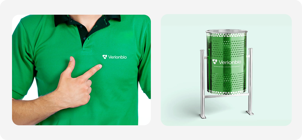
3D Brand Visualizations
To validate real-world applications, 3D mockups were created to visualize the brand across physical and environmental contexts. These visualizations ensured the identity translates effectively into signage, installations, and communication materials, reinforcing Verionbio’s commitment to sustainability and innovation.
The Impact
The new brand identity provided Verionbio with a strong and credible foundation to communicate its mission, values, and expertise within the biowaste management and sustainability sector. By translating complex environmental concepts into a clear and meaningful visual language, the identity helped position Verionbio as a trustworthy and forward-thinking organization.
Key outcomes
Clear and distinctive visual representation
Sustainability, water recycling, and circular resource management are now communicated through a refined and recognizable visual system, reducing reliance on generic environmental cues.
Improved brand recognition through meaningful symbolism
The logo and supporting elements use purpose-driven symbolism, enabling faster recall and stronger association with Verionbio’s environmental mission.
Consistency across digital and physical touchpoints
The unified visual language ensures the brand appears coherent and professional across presentations, digital platforms, environmental signage, and future communication materials.
Scalable identity system for long-term growth
The modular design system allows Verionbio to expand its services, outreach initiatives, and physical deployments without requiring redesign or visual reinvention.
Business & Mission Impact
The brand now supports clearer communication with stakeholders, partners, and communities by reinforcing credibility and environmental responsibility at every interaction point. The identity strengthens Verionbio’s ability to represent its long-term commitment to ecological restoration, innovation, and sustainable practices.
As a result, Verionbio presents itself as a confident, purpose-driven brand one that aligns visual expression with real-world environmental impact and positions the organization for sustained growth and recognition in the biowaste management space.
Conclusion
This engagement demonstrates how a well-crafted brand identity can translate complex environmental values into a clear and credible visual language. By grounding the design in symbolism, simplicity, and scalability, Verionbio gained a brand foundation that supports recognition, trust, and long-term impact in the sustainability and biowaste management sector.